
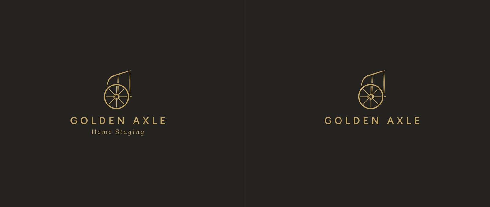
Building trust from day one
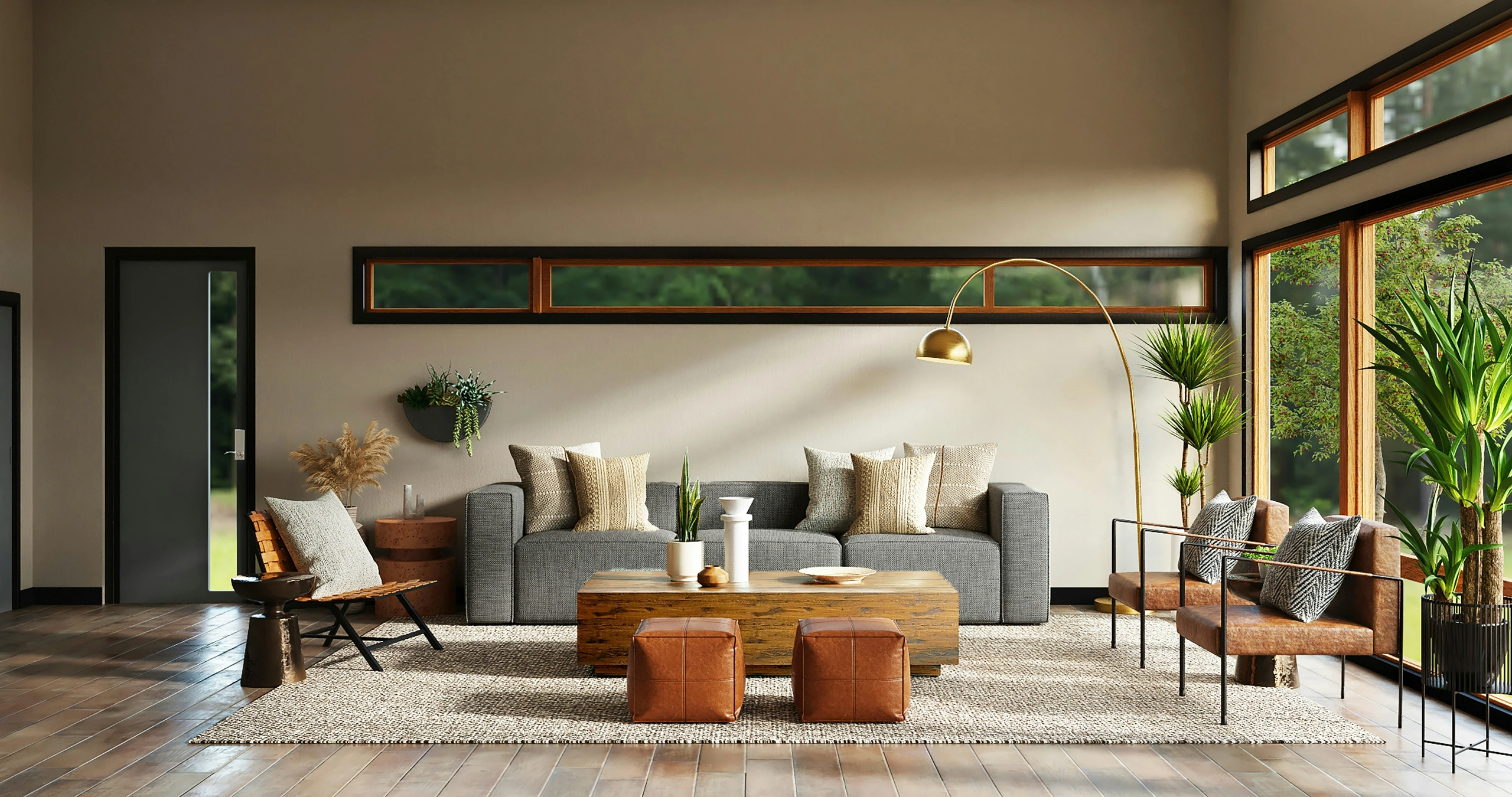
Golden Axle is a home staging business for property investors who want a property ready for market without managing every detail themselves. As a new business, it needed an identity that establishes credibility quickly and gives customers turnkey confidence.
The challenge
New businesses have to earn trust without years of recognition behind them.
Golden Axle needed to stand apart from staging brands built around trendy interiors and decorative aesthetics. Its customers are property investors who value reliability, good judgment, and the confidence that they can hand over the keys and have the rest taken care of.
What we did
We built the identity around one idea: turnkey confidence.
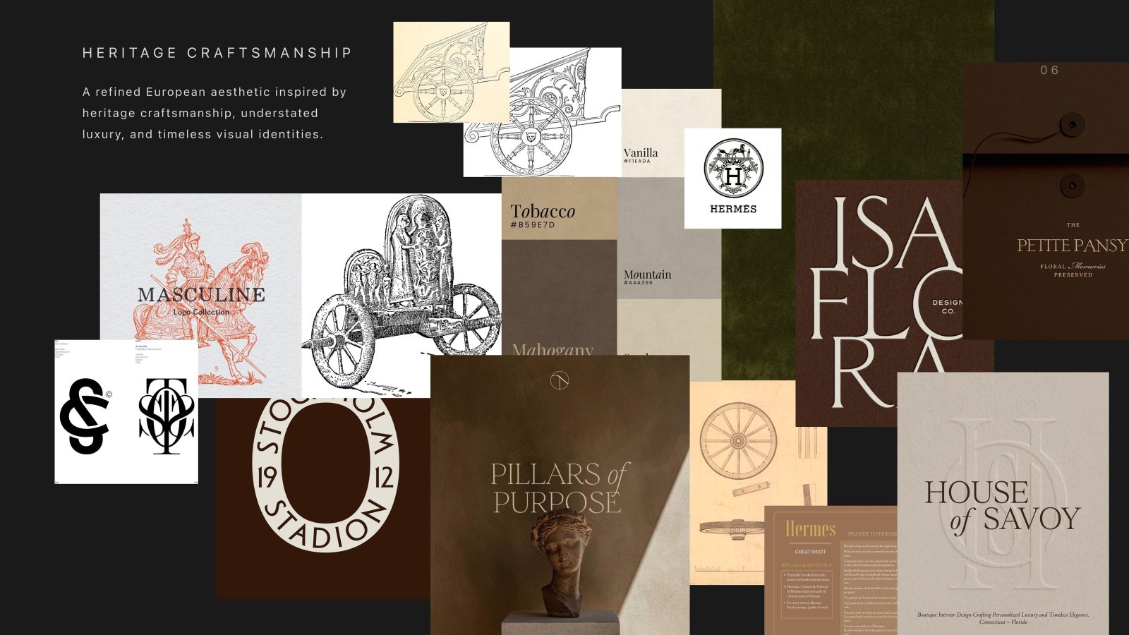
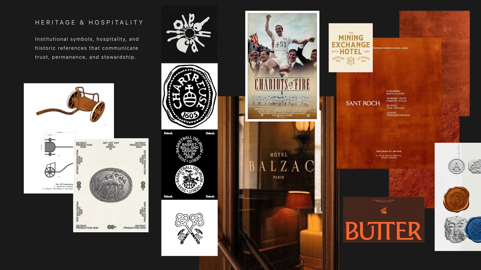
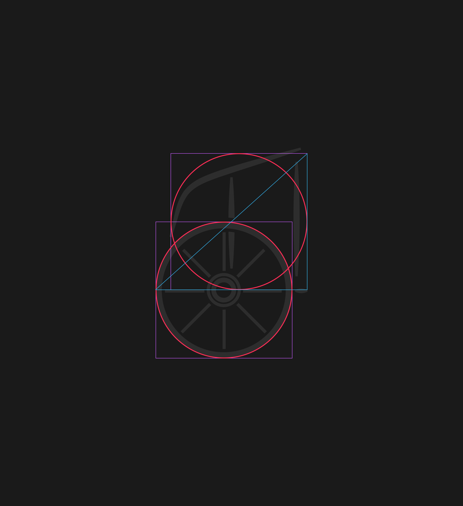
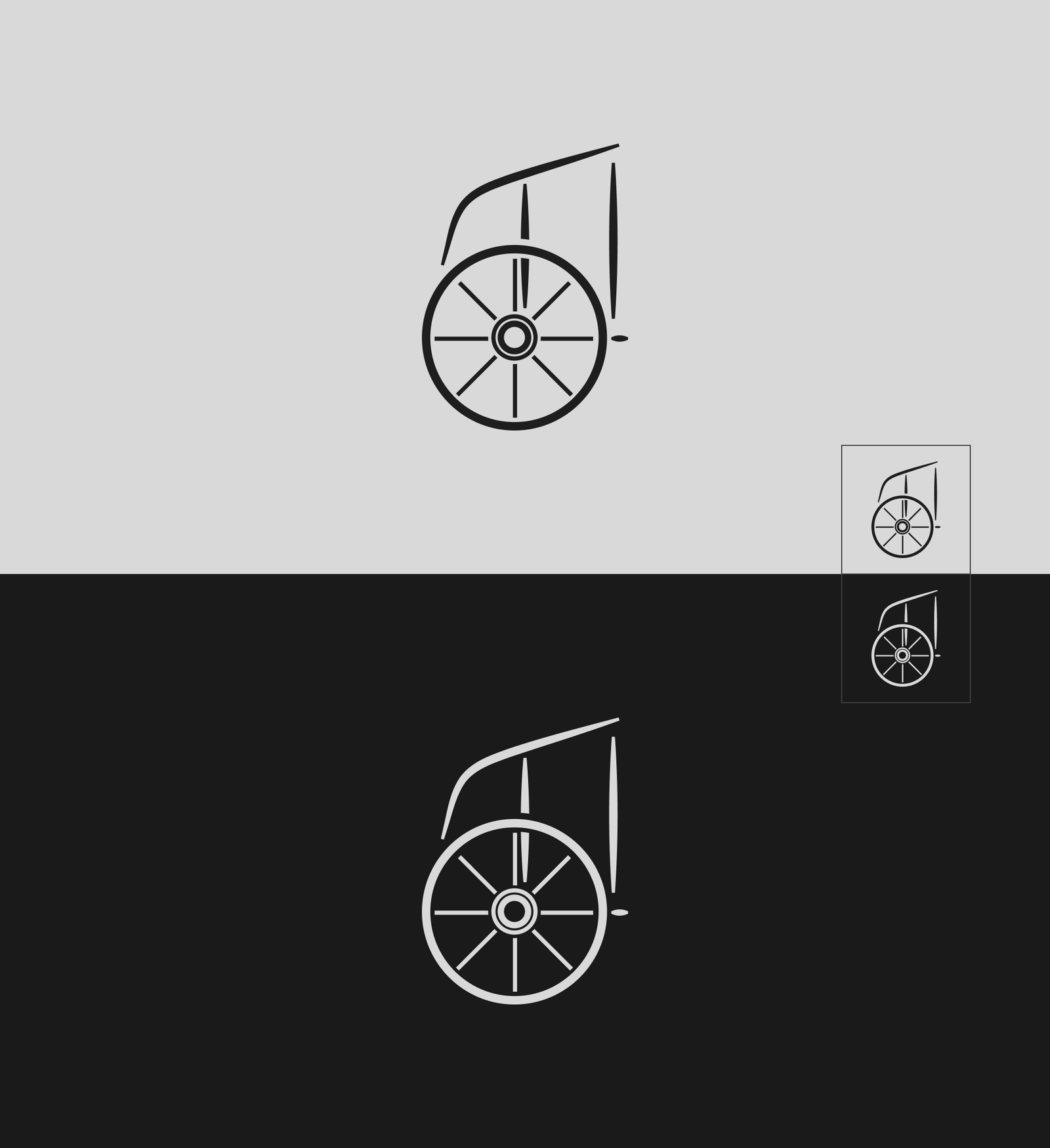
The visual direction combines the warmth of hospitality with the permanence of an established European brand. A distinctive chariot became the centre of the identity, supported by a restrained palette, typography, and a family of architectural forms inspired by entrances, keys, and thresholds.
Doorways, escutcheons, and portals.
The Golden Axle symbol can stand independently or within a family of architectural forms for secondary brand applications. Inspired by doorways, escutcheons, and keyhole plates, the forms extend the ideas of access and transformation into the broader identity.


I — Arch
Classical arched crown and grounded base for entry moments, property markers, and architectural signage.


II — Capsule
Continuous pill curve inspired by lock plates and protective escutcheons, tailored for seals and collateral badges.


III — Portal
Flat upper horizon paired with a soft curved threshold base, framing key handover moments and investor presentations.
Editorial warmth meets modern restraint.
A considered two-typeface system designed for clarity and timeless authority. Lora brings classic editorial grace to headlines and pull quotes, while Figtree provides clean, architectural precision for information hierarchy, body text, and digital touchpoints.
Homes prepared to make an impression
H1 / Display Lora Medium Italic
STAGING THAT BRINGS OUT THE VALUE IN EVERY SPACE
H2 / Section Heading Figtree
DESIGNED FOR THE WAY BUYERS SEE A HOME
H3 / Content Heading Figtree
Thoughtful home staging creates an immediate sense of possibility, helping buyers connect with a property from the moment they walk in.
Body / Regular Figtree
“A well-staged home doesn’t just show better. It feels more complete.”
Quote / Editorial Lora Medium Italic
OUR APPROACH
Label / Eyebrow Figtree
BOOK A CONSULTATION →
Button / CTA Figtree
2026 GOLDEN AXLE HOME STAGING
Caption / Small Figtree
Make your first impression count.
We build distinctive brand identities that help businesses stand out, earn trust, and stay memorable.
Warm, grounded, and enduring.
Antique Gold is the signature brand color. Carbon and Plaster form the primary neutral foundation, while Aged Stone supports backgrounds and secondary applications. Oxblood and Deep Olive are accents and should be used selectively rather than as dominant brand colors.
Antique Gold
Signature brand color & hallmark chariot mark tone
- RGB
- 192 · 163 · 101
- CMYK
- 0 · 15 · 47 · 25
Carbon
Primary neutral foundation & deep contrast ground
- RGB
- 37 · 35 · 31
- CMYK
- 0 · 5 · 16 · 85
Plaster
Warm light base, editorial canvas & stationery
- RGB
- 244 · 240 · 232
- CMYK
- 0 · 2 · 5 · 4
Aged Stone
Subdued secondary backgrounds & architectural tone
- RGB
- 162 · 141 · 104
- CMYK
- 0 · 13 · 36 · 36
Selective, nature-inspired depth
Oxblood and Deep Olive introduce richer, nature-inspired tones to the system. Designed for selective use, they add depth and variation without competing with Antique Gold as the signature brand color.
The outcome
A complete identity system Golden Axle can use as the business grows, from its first customer touchpoint to future digital and physical applications.
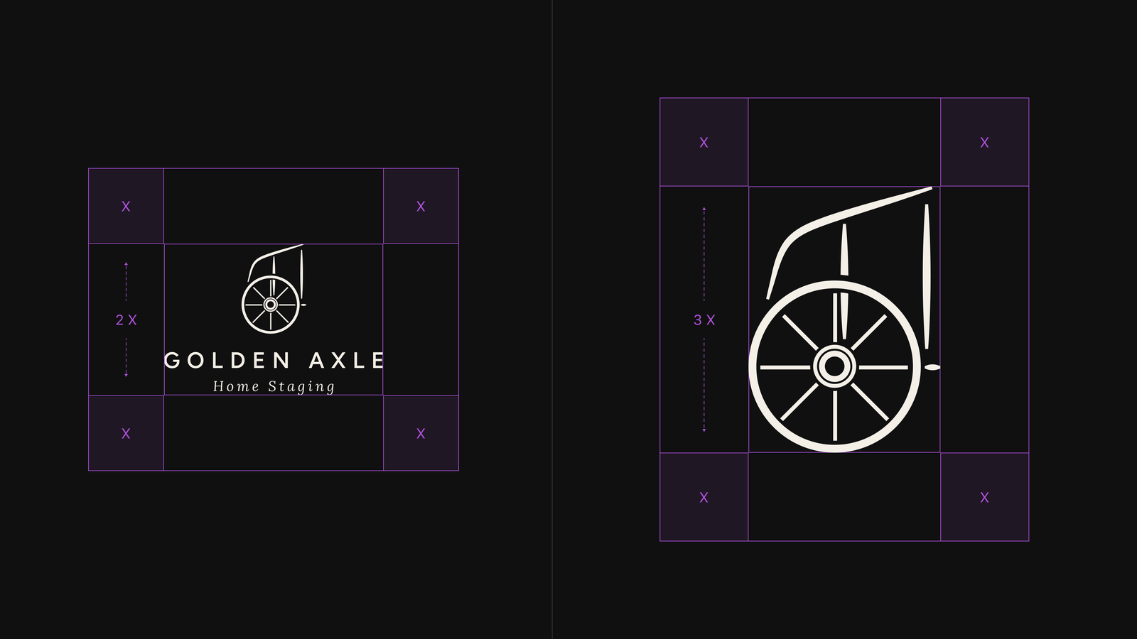
The system includes primary and simplified logos, the chariot mark, secondary brand symbols, typography, colour, light and dark applications, usage guidelines, and production-ready assets.
“The result exceeded all my expectations.”
The design truly reflects who I am. The logo captures everything I wanted Golden Axle to feel like. I love our chariot.